# 其他组件
# 弹窗 lg-model
(1.1.1新增)
| 属性 | 描述 | 类型 | 默认值 | 可选值 |
|---|---|---|---|---|
| type | 类型 | string | page | dialog pageiframe loadingdrawer photos notifiy |
| title | 标题 | string/boolean | 信息 | – |
| titleStyle | 标题样式 | string | – | – |
| content | 内容 | string | – | – |
| v-model | 显示 | boolean | false | true false |
| offset | 位置 | string /array | auto | – |
| area | 尺寸 | string/ array | auto | – |
| move | 拖拽 | boolean | true | true false |
| maxmin | 缩放 | boolean | false | true false |
| resize | 拉伸 | boolean | false | true false |
| anim | 入场动画 | number | 0 | 0 - 6 |
| isOutAnim | 出场动画 | boolean | true | true false |
| btnAlign | 按钮位置 | string | r | l c r |
| closeBtn | 关闭按钮 | boolean/ string | 1 | false 1 2 |
| time | 关闭时间 | number | 0 | – |
| shade | 遮盖层 | boolean | true | true false |
| shadeClose | 遮盖层关闭 | boolean | true | true false |
| shadeOpacity | 遮盖层透明度 | string | 0.1 | 0.1 - 1 |
| shadeStyle | 遮盖层样式 | string /StyleValue | ||
| isHtmlFragment | 解析 html 字符 | boolean | false | true false |
| imgList | 图片数据数组 | array | - | [{src:图片链接, alt:图片名字可选’, thumb:‘缩略图可选’}] |
| startIndex | 图片初始浏览索引 | number | 0 | - |
| full | 最大化回调 | function | - | - |
| min | 最小化回调 | function | - | - |
| restore | 重置回调 | function | - | - |
| success | 打开回调 | function | - | - |
| end | 销毁回调 | function | - | - |
| close | 点击右上角 close 按钮 / 遮盖层的关闭回调 | function | - | - |
| moveOut | 是否可以拖出浏 览器可视区域 | boolean | false | true false |
| moveStart | 拖拽开始回调 | function | - | - |
| moveEnd | 拖拽结束回调 | function | - | - |
| animDuration | 动画速率 | string | 0.3s | - |
# 可调用事件
| 名称 | 说明 | 传入参数 |
|---|---|---|
| min | 最小化 | |
| full | 最大化 | |
| restore | 重置 | |
| success | 成功 | |
| end | 销毁 | |
| close | 关闭 | |
| beforeClose | 关闭前置 | |
| moveStart | 拖拽开始 | |
| moving | 拖拽中 | |
| moveEnd | 拖拽结束 |
# 案例:
<template>
    <div>
        <button @click="openiframe">打开内嵌网页</button>
        <button @click="openpage">打开弹窗</button>
        <button @click="opendrawer">打开抽屉</button>
        <button @click="opendialog">打开普通消息</button>
        <button @click="openloading">打开加载动画</button>
        <button @click="openphotos">打开相册展示</button>
        <button @click="opennotifiy">打开消息通知</button>
        <div>-----------------------------------------------------</div>
        <div>
    //普通弹窗
			<lgModel v-model="visible1">
				<div>内容</div>
			</lgModel>
    //内嵌网页
	<lgModel v-model="visible2" type='iframe' content='https://md.dev.hblg.vip/'
    :area="['90%', '90%']">
			</lgModel>
    //抽屉
			<lgModel v-model="visible3" type='drawer'>
			</lgModel>
            <button @click="visible2=!visible2">打开内嵌网页2</button>
            <button @click="visible1=!visible1">打开弹窗2</button>
            <button @click="visible3=!visible3">打开抽屉2</button>
        </div>
    </div>
</template>

<script setup>
import { lg,lgModel } from '/packages/index.js';
import {ref } from 'vue';
const visible1 = ref(false);
const visible2= ref(false);
const visible3= ref(false);
//内嵌网页
const openiframe = () => {
    lg.open({
        maxmin: true,
        type: 'iframe',
        title: '远程页面',
        area: ['90%', '90%'],
        content: 'https://md.dev.hblg.vip/'
    });
};
// 插槽页面
const openpage = function () {
    lg.open({
        type: 'page',
        title: '标题',
        content: '内容'
    });
};
// 抽屉
const opendrawer = function () {
    // lg.drawer
    lg.open({
        type: 'drawer',
        title: '标题',
        content: '内容'
    });
};

// 普通消息
const opendialog = function () {
    lg.open({
        type: 'dialog',
        title: '标题',
        content: '内容'
    });
};
// 加载动画
const openloading = function () {
    // lg.load
    lg.open({
        type: 'loading',
        title: '标题',
        content: '内容'
    });
};
// 相册展示
const openphotos = function () {
    // lg.photos
    lg.open({
        type: 'photos',
        imgList: [
            {
                src: 'https://md.dev.hblg.vip/assets/img/logo.png',
                alt: 'logo.png'
            }
        ]
    });
};
// 消息通知
const opennotifiy = function () {
    // lg.notifiy
    lg.open({
        type: 'notifiy',
        title: '标题',
        content: '默认就是右上,也是用得最多的'
    });
};
</script>

<style></style>
# 宫格布局lg-grid
宫格组件一般用于同时展示多个卡片类型页面,该组件可以实现卡片响应式居中
# lg-grid
| 参数 | 说明 | 类型 | 必须 | 默认值 |
|---|---|---|---|---|
| width | 宽度 | String/Number | 否 | 400 |
| autoWidth | 宽度自适应(1.1.1新增) | Boolean | 否 | false |
| gridStyle | 插入样式 | Object | 否 | |
| fill | 填充方式(fill/fit) | String | 否 | fill |
# lg-grid-item
| 参数 | 说明 | 类型 | 必须 | 默认值 |
|---|---|---|---|---|
| itemStyle | 自定义样式,对象形式 | Object | 否 | |
| itemClass | 自定义样式 | String | 否 |
# 案例:
<template>
	<div>
		<lg-grid :width='400' :item='4'>
		<lg-grid-item  v-for="i in 7" :key="i">
		<div class="grid-demo">{{i}}</div>
		</lg-grid-item>
		</lg-grid>
	</div>
</template>
<style lang="less" scoped>
	.grid-demo{
		background-color: #409eff;
		align-items: center;justify-content: center;
		width: 100%;
		display: flex;
		color: #fff;
		font-size: 32px;
		height: 100px;
	}
</style>
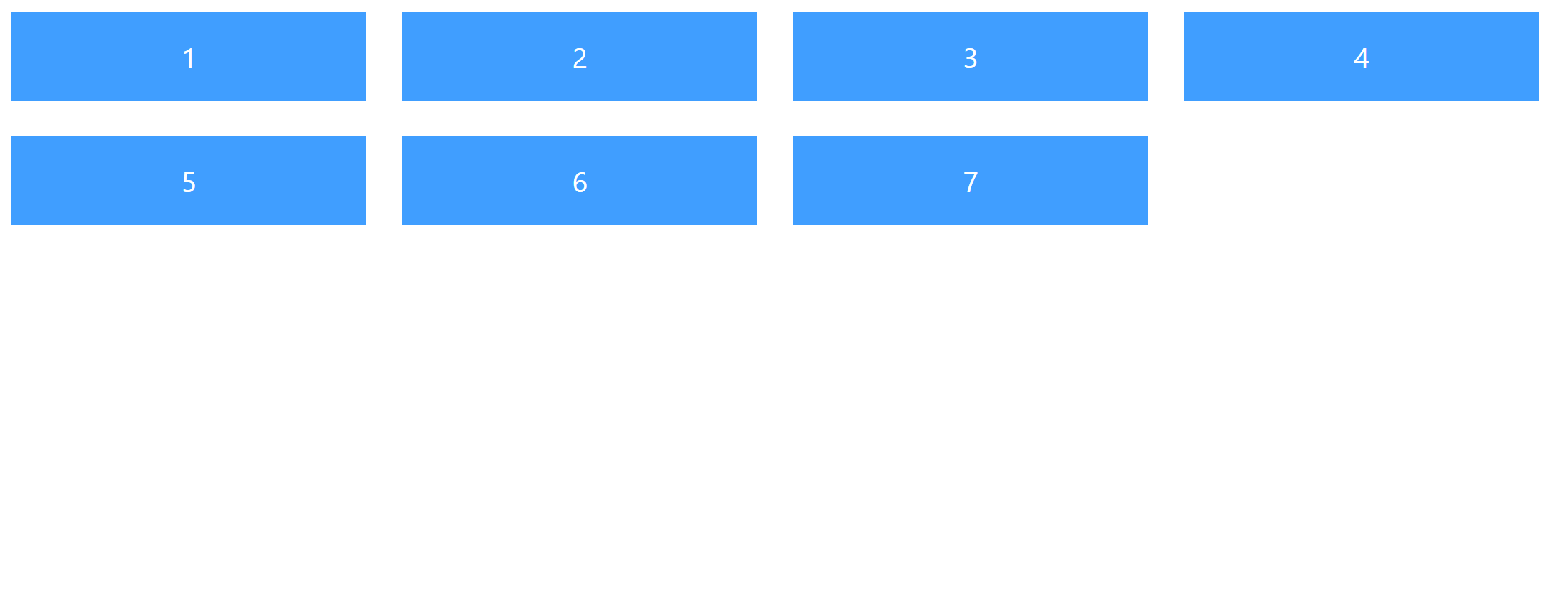
# 效果如下:
# 直播视频 lg-video
| 参数 | 说明 | 类型 | 必须 | 默认值 |
|---|---|---|---|---|
| url | 视频地址 | String | 是 | |
| vid | 实例id | String/Number | 否 | 随机数 |
| width | 提示内容 | String | 否 | 100% |
| height | 高度 | Number/String | 否 | 800 |
| auto | 是否自动注册实例 | Boolean | 否 | true |
| autoplay | 自动播放 | Boolean | 否 | false |
| autoplayMuted | 静音自动播放 | Boolean | 否 | false |
| long | 是限制持续播放 | Boolean | 否 | false |
| time | time | Number | 否 | 1 |
| title | 提示的标题 | String | 否 | 如需长期监测,请使用本地视频。 |
| isLive | 是否直播 | Boolean | 否 | true |
# 可调用事件
| 名称 | 说明 | 传入参数 |
|---|---|---|
| initVideo | 创建实例 | |
| openDestroy | 主动销毁实例(默认关闭页面销毁) |
案例:
<template>
	<div>
<lg-video  auto
 url='https://play.live.hblg.vip/live/SSAE-552091-AEFDC.m3u8' ></lg-video>
	</div>
</template>
# 裁剪图片 lg-imge-cropper
# 可调用事件
| 名称 | 说明 | 传入参数 |
|---|---|---|
| openChoose | 打开裁剪 |
# 插槽
| 名称 | 说明 | 调用值 |
|---|---|---|
| default | 默认插槽,用于创建按钮 |
# 回调
| 名称 | 说明 | 回调参数 |
|---|---|---|
| change | 确点击确定后回调事件 | Blob,base64 |
案例:
<template>
	<div>
		<lg-imge-cropper @change="change">

		</lg-imge-cropper>

	</div>
</template>
<script setup>

const change = (e,a) => {
  	console.log(e); //Blob
	console.log(a)//base64
}

</script>
# 虚拟滚动 lg-scroll
| 参数 | 说明 | 类型 | 必须 | 默认值 |
|---|---|---|---|---|
| height | 高度 | String | 否 | 100% |
| thumbWidth | 滑块宽度 | number | 否 | 6 |
| thumbColor | 滑块颜色 | String | 否 | #eeeeee |
| trackColor | 滑槽颜色 | String | 否 | rgba(0,0,0,0) |
案例:
<template>
	<div>
	<lgScroll   height='400px' >
<div v-for='one in 400'>{{one}}</div>
</lgScroll>
	</div>
</template>
# 全屏组件 lg-fullscreen
| 参数 | 说明 | 类型 | 必须 | 默认值 |
|---|---|---|---|---|
| target | 要全屏显示的元素 | HTMLElement | 否 | html |
| immersive | 全屏模式,false时浏览器窗口内全屏 | Boolean | 否 | true |
| position | 浏览器窗口内全屏定位模式,可选(absolute fixed) | String | 否 | |
| zIndex | 全屏层级 | Number/String | 否 |
# 可调用事件
| 名称 | 说明 | 传入参数 |
|---|---|---|
| enter | 进入全屏 | 可选,HTMLElement |
| exit | 退出全屏 | 可选,HTMLElement,Document |
| toggle | 进入/退出全屏 |
# 插槽
| 名称 | 说明 | 调用值 |
|---|---|---|
| default | 默认插槽,用于创建按钮 | enter,exit,toggle,isFullscreen(是否全屏) |
# 回调
| 名称 | 说明 | 回调参数 |
|---|---|---|
| fullscreenchange | 全屏更改事件回调 | 是否全屏 |
案例:
  <template>
  <lg-fullscreen :target="elRef" v-slot="{ enter, exit, toggle, isFullscreen }" @fullscreenchange="fullscreen2">
    <div ref="elRef" class="wrapper-fullscreen">
      <a-button type="normal" @click="enter()">进入全屏</a-button>
      <a-button type="normal" @click="exit()">退出</a-button>
      <a-button type="warm" @click="toggle()"> 切换: {{isFullscreen ? "退出" : "进入全屏"}} </a-button>
    </div>
  </lg-fullscreen>
</template>
<script setup>
 import {ref} from 'vue'

 const elRef = ref(null);
 const fullscreen2 = (isFullscreen)=>{
      console.log(isFullscreen)
    }

</script>