# 数据组件
# 表格 lg-table-api
注:1.1.1新增hooks方法
| 参数 | 说明 | 类型 | 必须 | 默认值 |
|---|---|---|---|---|
| listApi | 列表api函数 | Function | 是 | |
| columns | 表单配置描述 | Array | 是 | |
| select | 是否开启选择 | Boolean | 否 | false |
| selectList/v-model:selectList | 默认选择数据 | Array | 否 | |
| sieve | 默认需要筛选的值 | Object | 否 | |
| updateName | 更新标识(防止刷新冲突,页面存在多个表格需使用) | String | 否 | lgUpdateList |
| pagination | 是否分页或设置分页 | Boolean/Function | 否 | true |
| noData | 是否关闭初始化加载 | Boolean | 否 | false |
| pageType | 分页格式 | Object | 否 | |
| scroll | 是否滚动(1.1.0新增) | Boolean | 否 | true |
| sieveDeploy | 筛选框属性(1.1.0新增) | Object | 否 |
# 插槽
| 名称 | 说明 | 调用值 |
|---|---|---|
| topItem | 表格顶部插槽 | |
| actions | 默认操作栏插槽/需要在columns配置名称dataIndex为_actions的列, | column,record,index,indexs |
| 字段插槽如(name) | 各字段的插槽名称同dataIndex | column,record,text,index,indexs |
# 回调
| 名称 | 说明 | 回调参数 |
|---|---|---|
| change | 选中数据回调 | |
| page | 分页回调 | current,pageSize |
# 可调用方法
| 名称 | 说明 | 参数 |
|---|---|---|
| deriveExcel | 导出当前页数据, 选中则导出选中(1.1.1新增) | |
| initData | 刷新当前页(add,edit,delete)不同参数刷新方式不同 | 默认(add) |
| getData | 获取当前页数据 |
# pageType
类型:Object
描述:自定义分页格式
{page:'current',limit:'size',total:'total',list:'records'}
page 页
limit 页条数
total 长度
list 列表数据
# columns
类型:Array
描述:用于表头名称配置,在a-table原有基础上增加如下配置
columns:[
            {
			show:true,//设置show为true表示该列不在列表中显示
             rich_text:true,//是否为富文本
             function: e =>{return e?'是':"否"}, //插入一个函数用于数据格式化
                 sieve:'select',
                options: 'sex',//关联字典,
                //如需插入表进行筛选,请使用插入自定义数据关联数据列表,具体用法见lg-sieve
                 deploy:{value:'id',label:'name',placeholder:"请选择"}
			}
			 ],
案例1:
<template>

	<lg-table-api :listApi='positionPage'
	 :columns='data.columns'>
		  <template #actions="{ column, record, indexs, index }">
				<Button type="link" size="small"  > 编辑 </Button>
		  </template>
		  </lg-table-api>
</template>
<script setup>
	import  {positionPage} from '../api/unify.js'
    import { Button } from 'ant-design-vue';
	import {lgTableApi} from 'lg-ui-pro'
	import { reactive } from 'vue';
    let data =reactive({
			columns: [
						{
						  title: '序号',
						  dataIndex: 'index',
						  width:70
						},
			         {
			           title: '名称',
			           dataIndex: 'name',
			         },
					 {
					   title: '分类',
					   dataIndex: 'category',
					   sieve:'select' ,//筛选类型
					   options:'POSITION_CATEGORY' //筛选关联字典项
					 },

					  {
					    title: '操作',
					    dataIndex: '_actions',
						width:160
					  },
			       ],
	})


</script>
案例2:
1.1.1新增
<template>
 <Button size="small" @click="onUpdate">刷新</Button>
<lg-table-api >
 </lg-table-api>
</template>
<script setup>
     import { Button } from 'ant-design-vue';
	import  {positionPage} from '../api/unify.js'
	import {lgTableApi,lgUpdateList} from 'lg-ui-pro'
	import { reactive } from 'vue';
    //initTable 初始化注入表格属性
    lgTableApi.initTable({
        updateName:'tablename', //表格默认刷新标识(默认为lgUpdateList)(非必填)
        lgTableApi:positionPage, //列表api函数
        columns: :computed(() =>{  //表头
        return [
			{
		 title: '序号',
		 dataIndex: 'index',
			 width:70
			},
		{
		 title: '名称',
		 dataIndex: 'name',
		 },
			{
			 title: '分类',
		dataIndex: 'category',
		sieve:'select' ,//筛选类型
		options:'POSITION_CATEGORY' //筛选关联字典项
		},
		 {
			 title: '操作',
		dataIndex: '_actions',
		width:160
		},
	 ]
    }),
    sieve:{}, //默认筛选的属性(非必填)
     pagination:false, //是否分页或设置分页(非必填)
    pageType:{}, //分页格式(非必填)
	limit:20,//每页默认条数(非必填)
	afterData:(e)=>{return e},//表格请求前钩子函数,(非必填)
	beforeData:(e)=>{return e},//表格请求后钩子函数,(非必填)
    noData:false //是否关闭初始化加载(非必填)
	})
    //刷新表格
    const onUpdate=()=>{

  /**
 * 刷新api表格:同lg-util的lgUpdateList,区别是lg-util使用的是mitt,
 * lg-ui-pro则直接使用hooks调用稳定性更高。
 * @param {obj} obj刷新方式和传入值,'add'或 {sieve:{name:'你好'},type:'add'}
 * @param {String} name 表格刷新标识(默认为lgUpdateList)
 */
        lgUpdateList('add','tablename')
    }
</script>
# 注意
表格如果设置为滚动,则默认占满盒子剩余高度,如出现表格不显示请查看外层div是否设置了高度
模块化开发通用设置方式如下
# 1.直接使用,不进行嵌套
<template>
<lg-table-api></lg-table-api>
</template>

<script setup>
	import {lgTableApi} from 'lg-ui-pro'
</script>
# 2.设置外层高度
<template>
  <div style="height: 100%;">
<lg-table-api></lg-table-api>
  </div>
</template>

<script setup>
	import {lgTableApi} from 'lg-ui-pro'
</script>
# 宫格 lg-grid-api
注:1.1.2新增hooks方法,具体使用方法同lg-table-api
宫格初始化为initGrid,刷新方法为lgUpdateGrid
| 参数 | 说明 | 类型 | 必须 | 默认值 |
|---|---|---|---|---|
| listApi | 列表api函数 | Function | 是 | |
| columns | 筛选描述 | Array | 是 | |
| sieve | 默认需要筛选的值 | Object | 否 | |
| updateName | 更新标识(防止刷新冲突,页面存在多个需使用) | String | 否 | lgUpdateList |
| pagination | 是否分页或设置分页 | Boolean/Function | 否 | true |
| noData | 是否关闭初始化加载 | Boolean | 否 | false |
| pageType | 分页格式 | Object | 否 | |
| scroll | 是否滚动 | Boolean | 否 | true |
| sieveDeploy | 筛选框属性 | Object | 否 | |
| gridClass | 表格class | Array/String | 否 |
# 插槽
| 名称 | 说明 | 调用值 |
|---|---|---|
| topItem | 表格顶部插槽 | |
| body | 内容的插槽 | record,index |
# 回调
| 名称 | 说明 | 回调参数 |
|---|---|---|
| change | 选中数据回调 | |
| page | 分页回调 | current,pageSize |
# 可调用方法
| 名称 | 说明 | 参数 |
|---|---|---|
| initData | 刷新当前页(add,edit,delete)不同参数刷新方式不同 | 默认(add) |
| getData | 获取当前页数据 |
# pageType
类型:Object
描述:自定义分页格式
{page:'current',limit:'size',total:'total',list:'records'}
page 页
limit 页条数
total 长度
list 列表数据
# columns
类型:Array
描述:主要用于筛选具体见lg-sieve
columns:[
            {
                 sieve:'select',
                options: 'sex',//关联字典,
                //如需插入表进行筛选,请使用插入自定义数据关联数据列表,具体用法见lg-sieve
			}
			 ],
刷新表格
import {lgUpdateGrid} from 'lg-ui-pro'
    //刷新
    const onUpdate=()=>{
  /**
 * 刷新宫格
 * @param {obj} obj刷新方式和传入值,'add'或 {sieve:{name:'你好'},type:'add'}
 * @param {String} name 表格刷新标识(默认为lgUpdateGrid)
 */
        lgUpdateGrid('add','tablename')
    }
</script>
案例1:
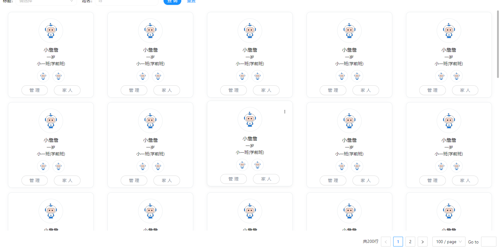
卡片列表
<template>
    <lgGridApi :listApi="demo" :columns="state.columns" width="280px"  :gridStyle="{ gap: '10px' }">
        <template #body="{ record }">
            <lgGridItem :itemStyle="{ aspectRatio: '1/1' }">
                <div class="grid-body">
                    <Dropdown :overlayStyle="{ zIndex: '999' }" placement="bottomRight">
                        <template #overlay>
                            <div class="dropdown-menu">
                                <div class="dropdown-menu-item">查看</div>
                                <div class="dropdown-menu-item">编辑</div>
                                <div class="dropdown-menu-item item-delete">删除</div>
                            </div>
                        </template>
                        <div class="body-dropdown">
                            <svg
                                xmlns="http://www.w3.org/2000/svg"
                                aria-hidden="true"
                                role="img"
                                width="1em"
                                height="1em"
                                viewBox="0 0 24 24"
                                data-icon="feather:more-vertical"
                                class="iconify iconify--feather" >
                                <g fill="none" stroke="currentColor" stroke-linecap="round" stroke-linejoin="round" stroke-width="2">
                                    <circle cx="12" cy="12" r="1"></circle>
                                    <circle cx="12" cy="5" r="1"></circle>
                                    <circle cx="12" cy="19" r="1"></circle>
                                </g>
                            </svg>
                        </div>
                    </Dropdown>
                    <div class="grid-body-img">
                        <img src="/src/assets/avatar.gif" />
                    </div>
                    <div class="grid-body-title">
                        <div class="body-title-name">{{record.name}}</div>
                        <div calss='body-title-tig'>{{record.aeg}}</div>
                        <div calss='body-title-tig'>{{record.class}}({{record.grade}})</div>
                    </div>
                    <div class="grid-body-parent">
						  <Tooltip v-for="(item,index) in record.parent" :key="index">
						    <template #title>{{item.name}}</template>
						  <div><img src="/src/assets/avatar.gif" /></div>
						  </Tooltip>
                    </div>
                    <div class="grid-body-buttom">
                        <div style="margin: 0 10px">
                            <Button shape="round"><span class="button-name">管理</span></Button>
                        </div>
                        <div style="margin: 0 10px">
                            <Button shape="round"><span class="button-name">家人</span></Button>
                        </div>
                    </div>
                </div>
            </lgGridItem>
        </template>
    </lgGridApi>
</template>
<script setup>
import { Button, Dropdown,Tooltip } from 'ant-design-vue';
import { reactive } from 'vue';
import { lgGridApi } from '/packages-pro/index.js';

function demo(payload) {
    return new Promise((resolve, reject) => {
        try {
            let datas = [];
            for (let i = 0; i < 40; i++) {
                datas = [
                    ...datas,
                    {
                        id: i,
                        name: '小詹詹',
                        aeg: '一岁',
                        class: '小一班',
                        grade: '学前班',
                        parent:[{name:'大詹詹'},{name:'大詹詹'}]

                    }
                ];
            }
            let list = {
                data: {
                    total: 200,
                    current: 1,
                    size: 100,
                    records: datas
                }
            };
            resolve(list);
        } catch (e) {
            reject(false);
        }
    });
}

const state = reactive({
    selectList: [],
    columns: [
        {
            title: '标题',
            dataIndex: 'title',
            sieve: 'select',
            options: [[{ name: '111', id: '222' }]],
            deploy: { value: 'id', label: 'name' }
        },
        {
            title: '姓名',
            dataIndex: 'name',
            sieve: 'input',
            deploy: { placeholder: 'id' }
        }
    ]
});
</script>

<style lang="less" scoped>
.grid-body {
    display: flex;
    align-items: center;
    flex-direction: column;
    padding: 20px;
    position: relative;
    margin-top: 5px;
    background-color: #fff;
    height: 100%;
    border-radius: 0.75rem;
    transition: all 0.3s;
    border: 1px solid #e9edef;
    cursor: pointer;
    box-shadow: 0px 1px 10px rgb(51 54 74 / 5%);
    &-img {
        width: 80px;
        height: 80px;
        border-radius: 50%;
        padding: 10px;
        border: 1px solid #e9edef;
        img {
            width: 100%;
        }
    }
    &-title {
        display: flex;
        flex-direction: column;
        align-items: center;
        padding: 10px 0;
    }
    &-parent {
        display: flex;
        align-items: center;
        div {
            width: 40px;
            padding: 5px;
            border: 1px solid #e9edef;
            border-radius: 50%;
            margin: 0 5px;
        }
        img {
            width: 100%;
        }
    }
.grid-body-title{
	.body-title-name{
		font-size: 1rem; font-weight: 500;
	}
	.body-title-tig{
		color: rgb(148, 163, 184); font-size: 0.75rem;
	}

}
.grid-body-buttom{
	display: flex; padding-top: 10px;
	.button-name {
		color: #868e9a; padding: 0 10px;
	}
}
    .body-dropdown {
        position: absolute;
        right: 10px;
        top: 20px;
        font-weight: bold;
        height: 30px;
        width: 30px;
        border-radius: 50%;

        display: none;
        justify-content: center;
        align-items: center;
    }

    .body-dropdown:hover {
        background-color: rgb(242, 242, 242);
    }
}

.dropdown-menu {
    box-shadow: 0 5px 16px #0000000d;
    background-color: #fff;
    border: 1px solid rgb(237, 237, 237);
    .item-delete {
        border-top: 1px solid rgb(237, 237, 237);
    }
    .dropdown-menu-item {
        padding: 10px 50px;
        cursor: pointer;
        &:hover {
            background-color: #0000000d;
        }
    }
}

.grid-body:hover {
    box-shadow: -1px 3px 10px 0 rgb(0 0 0 / 6%);
    transform: translateY(-5px);
    .body-dropdown {
        display: flex;
    }
}
</style>
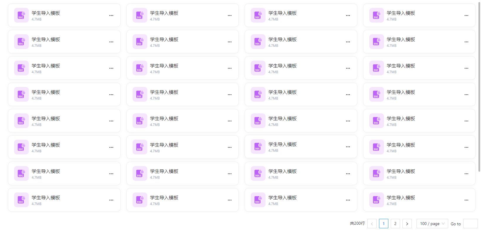
效果如下:
案例2:
瓦片列表
<template>
    <lgGridApi :listApi="demo" :columns="state.columns" width="320px" :gridStyle="{ gap: '10px 20px', padding: '0 10px' }" autoWidth>
        <template #body="{ record }">
            <lgGridItem :itemStyle="{ height: '80px' }">
                <div class="grid-body">
                    <Dropdown :overlayStyle="{ zIndex: '999' }" placement="bottomRight">
                        <template #overlay>
                            <div class="dropdown-menu">
                                <div class="dropdown-menu-item">下载</div>
                                <div class="dropdown-menu-item">编辑</div>
                                <div class="dropdown-menu-item item-delete">删除</div>
                            </div>
                        </template>
                        <div class="body-dropdown">
                            <svg
                                data-v-26e5b7b0=""
                                xmlns="http://www.w3.org/2000/svg"
                                xmlns:xlink="http://www.w3.org/1999/xlink"
                                aria-hidden="true"
                                role="img"
                                class="icon nui-context-icon"
                                width="1.2em"
                                height="1.2em"
                                viewBox="0 0 24 24"
                            >
                                <g fill="none" stroke="currentColor" stroke-linecap="round" stroke-linejoin="round" stroke-width="2">
                                    <circle cx="12" cy="12" r="1"></circle>
                                    <circle cx="19" cy="12" r="1"></circle>
                                    <circle cx="5" cy="12" r="1"></circle>
                                </g>
                            </svg>
                        </div>
                    </Dropdown>
                    <div class="grid-body-img">
                        <img src="/src/assets/doc-2.svg" />
                    </div>
                    <div class="grid-body-title">
                        <div class="body-title-name">学生导入模板</div>
                        <div class="body-title-size">4.7MB</div>
                    </div>
                </div>
            </lgGridItem>
        </template>
    </lgGridApi>
</template>
<script setup>
import { Dropdown } from 'ant-design-vue';
import { reactive } from 'vue';
import { lgGridApi } from '/packages-pro/index.js';

function demo(payload) {
    return new Promise((resolve, reject) => {
        try {
            let datas = [];
            for (let i = 0; i < 40; i++) {
                datas = [
                    ...datas,
                    {
                        id: i,
                        name: '学生导入模板',
                        size: '4.7MB',
                    }
                ];
            }
            let list = {
                data: {
                    total: 200,
                    current: 1,
                    size: 100,
                    records: datas
                }
            };
            resolve(list);
        } catch (e) {
            reject(false);
        }
    });
}

const state = reactive({
    columns: [
        {
            title: '标题',
            dataIndex: 'title',
            sieve: 'select',
            options: [[{ name: '111', id: '222' }]],
            deploy: { value: 'id', label: 'name' }
        },
        {
            title: '姓名',
            dataIndex: 'name',
            sieve: 'input',
            deploy: { placeholder: 'id' }
        }
    ]
});
</script>

<style lang="less" scoped>
.grid-body {
    display: flex;
    align-items: center;
    padding: 20px;
    position: relative;
    margin-top: 5px;
    background-color: #fff;
    height: 100%;
    border-radius: 0.75rem;
    transition: all 0.3s;
    border: 1px solid #e9edef;
    cursor: pointer;
    box-shadow: 0px 1px 10px rgb(51 54 74 / 5%);
    &-img {
        width: 50px;
        height: 50px;

        img {
            width: 100%;
        }
    }
    &-title {
        display: flex;
        margin-left: 10px;
        flex-direction: column;
        padding: 10px 0;
    }

    .body-dropdown {
        position: absolute;
        right: 10px;
        top: 20px;
        font-weight: bold;
        height: 40px;
        width: 40px;
        border-radius: 50%;
        display: flex;
        justify-content: center;
        align-items: center;
        transition-duration: 0.3s;
        transition-property: transform;
        transition-timing-function: cubic-bezier(0.4, 0, 0.2, 1);
    }

    .body-dropdown:hover {
        transform: rotate(90deg);
        background-color: rgb(242, 242, 242);
    }
}
  .grid-body-title{
	   .body-title-name{
		   font-size: 1rem; font-weight: 500;
	   }
	   .body-title-size{
		   color: rgb(148, 163, 184); font-size: 0.75rem;
	   }
  }
.dropdown-menu {
    box-shadow: 0 5px 16px #0000000d;
    background-color: #fff;
    border: 1px solid rgb(237, 237, 237);
    .item-delete {
        border-top: 1px solid rgb(237, 237, 237);
    }
    .dropdown-menu-item {
        padding: 10px 50px;
        cursor: pointer;
        &:hover {
            background-color: #0000000d;
        }
    }
}

.grid-body:hover {
    box-shadow: -1px 3px 10px 0 rgb(0 0 0 / 6%);
    transform: translateY(-2px);
}
</style>
效果如下: